Autumn Sky - Interior Colour Scheme Course - Part1

In this Digital course I’m going to share with you some of the techniques I like to use when I’m wanting to get inspired about a prospective Interior Design Project.
Its all of the ‘how does she do that’ stuff, which can in turn help you to channel your creativity that maybe you didn’t know you had.
I hear so often from clients and friends that
“…I’m just so useless with colour.”
“ I don’t have the eye for it.”
“ I have no idea where to start”
Well write here I’m going to show you one of the ways you can create a colour palette that you can get excited about, and in the following trainings, just how we can turn that palette into a cohesive Interior/Exterior room.
Part 1 – Take Inspiration
I am all about feeling connected to the space we call home, and sometimes picking your aesthetic from a catalogue can mean you ‘get over it’, the trend quickly passes on, or the design is completely disjointed from the architecture of your own home.
So first up finding inspiration that really connects with you, is something that is the foundation to your creation. I recommend starting with something that your either passionate about or what really lights your inner fire.
For example, I love being able to eat from my Vege garden, and often while I’m watering my garden at the end of the day, especially during late Summer/ early Autumn there are the most beautiful sunsets. To me this is an absolute moment of gratitude for the earth and the blessing of five minutes to take a deep breath, in total appreciation for life.

Here I managed to snatch a photo with my phone so that I could remind myself of the pure beauty in that moment.
There was such a magic feeling when I was enjoying that Sunset that it makes perfect sense to design a potential Interior Space from it. For you it might be Mountain Biking in the Redwoods, a day with the kids at Blue Lake or even just a photo of your Dog that brings you this feeling. Whatever it is, you can extract colour from it and then re-imagine that feeling within your home so that you can experience a piece of that feeling every day when you wake up, or cook dinner, or even brush your teeth.
You have your inspired image to work from. Your starting point!
Now we have that covered, I always enjoy the next step.
You may need to pop into your local decorating specialist such as Guthrie Bowron or Bunnings if you don’t own a Colour Atlas or Fan Deck. Take a digital copy of your image with you whether its on your phone, tablet or camera. This way you can reference the colours authentically.
My personal favorite is the Dulux Colours of New Zealand. Their colour wall is extremely comprehensive as it lays out the Saturated colours toward the top, the more pastel through the middle and then the more neutral/non-saturated toward the bottom.
At this point, really don’t let yourself get bogged down with what colours are meant for what area. Here we really want to capture the essence of what you saw, felt and experienced during the moment you took your inspired image. Truly think about how you felt in that moment and select a range of colour samples that you see within the image.
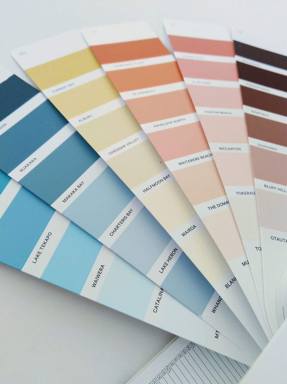
In my example for the Autumn Sunset, I’ve grabbed 6 pages from the Dulux Colours of New Zealand Fan Deck. I have no idea of the pragmatics of these colours at this point, just that within those 6 pages I have captured the same feeling I had looking at that Sunset. Now we have a manageable kaleidoscope of colour, weened down from potentially thousands. If you like numbers I have 36 colours that I can reference when needed.
To create our base palette for the Interior we need to strip back and narrow our selection one step further. Reference your image again, get that feeling back. You might need to be outside to get the best lighting to help you out.
Now we are going to select a minimum of 3 colours but a maximum of 6 from our swatches. This doesn’t mean we can no longer reference or use the other colours if we don’t pick them. We are simply finding those colours that ‘light our fire’ or ‘calm us down’ which ever your intention.
I now have my 6 for the Autumn Sunset. Why did I choose 6? I love colour, I liked the even nature, the symmetry. Other than that, I picked what felt right for me. For you it could be 4 colours. You can’t do it wrong because it’s your inspiration.

My Top Six
Lake Heron – is calming (a deep breath)
Albury – has a tender warmth
Flat Point – has the fire/heat
The Domain – the candy/ice cream
Waiwera – the energy
Passage Rock – the dusk
Side Note – I love the place names for colour, as I am challenged when it comes to geography so its always fun to guess what part of the country I’m connecting with. I do also get clients that love a colour in part because of its name and that the place means something to them on a personal level.
I’ve adapted a meaning beside my selection of colours to demonstrate my feeling, however it’s not necessary. You can pick a colour purely because your drawn to it. Your decision doesn’t need to be justified. Typically, colours that draw us in are colours we will enjoy for a long time. The important thing is when you look at your top 3-6 colours do you still feel what you felt when you took your inspired image? If not, then try a new combination from the original kaleidoscope sampling until you feel right and good with what you have chosen.
*Tip* - Make sure you isolate your Top Picks onto a separate page. Cut and Paste so you have clarity when you look at the samples.
In Part 2 of the course we will take our colour palette and begin to apply it to the project. I’ll be explaining how we can transfer this palette into a mood board with the introduction of possible finishes and products.
If you have any questions about the content please pop a comment below. Or send a message through my contact page, Instagram, Facebook, Pinterest.
Talk Soon
Loz xxx


